Monday 24 June 2013

Word of the Week-Radar

Happy Monday! I'm sorry this post is a couple days late. Last week got a little hecktic, but we're back on track. Fathers' Day Sunday's word was Radar; inspired by the song 'Radar Love' by Golden Earring. Here's what I came up with from start to finish:
Thumbnails

Stage 1: Drawing

Stage 2: Let the painting begin

Stage 3: finishing up.

Cut out and Scan the painting
Edit in PhotoShop

Ta Da! The Final Outcome!
This Thursday I'm heading up to Sauble Beach where I hope to do a lot of relaxing and even more illustrating. Stay tuned for another Word of the Week Illustration, and whatever else I come up with while soaking up the sun and chillin' by a fire!

~ Cheers, and if I don't talk to you before then, have a happy and safe Canada Day everyone [Or a wonderful weekend to all my friends not residing in Canada :) ]


Friday 14 June 2013

Word of the Week - Stichomythia

Good Morning,

I hope everyone is having a fantastic Friday -- Don't worry, only a few more hours!
Last sunday I posted on my Facebook page that I was going to get back in the habit of creating weekly illustrations. The plan is that every Sunday I'll post a word (hopefully not as strange as the first one I posted), and then people will post words they think of after reading the one I post. From there I'll use those words to create the illustration. It would also be really cool if people joined in on the fun to see what other interpretations come about.

Last Sunday's word was Stichomythia (Sticho-what?).  

Google defines it as: 
Noun; Dialogue in which two characters speak alternate lines of verse, used as a stylistic device in ancient Greek drama.

The words I got back for it were: ancient, play, converse, dramatic, and over-the-top.

Thumbnail Sketches
To start any project, I begin with a series of thumbnail sketches. One image stuck in my head this time and I really couldn't shake it.

I know the definition talks about conversation, and ancient Greek drama, but I couldn't get the Shakespearian era out of my head. The classic stage curtain, mixed with grecian goddess dresses lead me to an image of a personified curtain dancing.

Ancient=geek goddess
Play= 'playful' imagery, and Shakespeare's plays.
Dramatic= Personification.


Next, I prepared a 5"x7" image area on a piece of watercolour paper and began drawing my image. Then the fun started when I got to the paint. Turned on the classical music and away I went. I put tape 1/8" outside of the image area creating a 'bleed'. the bleed is there so that when I cut my image out, I won't get those annoying white edges.
Stage One
Stage 2 (added shadows and trim)
Next, I cut it out and scanned it. 
Scanned Image
Add some colour correction, and artistic tweaks in Adobe Photoshop CS5.
Screenshot while in Photoshop
And Voila! The final piece!

Check in on my Facebook page this Sunday for the next word. I'd love to see what you create too!

Have a fantastic weekend; and Happy Fathers Day to everyone celebrating, or remembering their father's this Sunday!

Cheers,
~ Jennifer


Thursday 13 September 2012

Live on Locke: The Music Movement Final Logo

Hello once again blogging world. Please forgive me for not keeping up with this blog over the summer.

Last we spoke, I posted about the progress we had made on the "The Music Movement" logo. Well earlier this summer we finished it and here is how the final product came about!

Here are the changes to the 3 comprehensives the clients wanted to see.
  
Taking their ideas we generated these logos .


The clients liked "Idea 3" best and so stands the Final "Live on Locke" logo! Keep an eye out; the first concert of the series is September 21, 2012. Visit http://www.liveonlocke.com/ for more information on this event and the next concerts in the series, as well as ticket booking information.


Thursday 31 May 2012

Live on Locke: The Music Movement - Logo Comprehensives

TMM_Comps
Stage 2 of The Music Movement logo is complete. My colleagues and I have developed a comprehensive design and have provided our clients with 4 colour schemes to choose from.


We have also learned a few things while working on a couple of projects recently, including this one. We've discovered that it is really difficult to have three people work on one aspect of a project. Too many fingers in a pie leads to too much confusion and a really big headache! So from now on everyone will do their own thing and we will ask each other for advice when/if we need it. I'm not sure why we started working this way, maybe just the excitement of the first project as "3J Design Solutions", but whatever the reason we've made corrections and are better than ever!

Now we are looking forward to what the clients have to say and to finishing their logo.


Sunday 20 May 2012

College Kids to Business (Wo)men

Well my college days are done and 'grown-up' life has come. Two years have flown by so quickly, and I have learned an incredible amount from all of the Graphic Design professors from Mohawk College; Thank you! I've also been blest with meeting tons of fabulous friends, some of which I consider family! Two of my closest friends I've made at college, I now call my colleagues. 3J Design Solutions is in the process of becoming a unique collaborative graphic design company. Jessica Bryers, Jessica Oddi, and myself (Jennifer Ridder) have come together with a shared vision. Each of us will specialize in a certain area with one umbrella area, that being illustration. I will focus on typesetting and layout design, Jessica Bryers is our proud packager, and Jessica Oddi is our web-design wizard. We all tackle other aspects of design as well; branding, advertising, ex-cetera, but those certain areas are our individual domains. Another great part of our business relates to the old addage: Three heads are better than one. On each project, big or small, we'll bounce ideas off of one another making concepts better and better.
We are working an a couple projects now while we continue the start-up process of our company. Our first project is a group in Hamilton (Ontario, Canada) organizing a Concert Series that will consist of 4 concerts, one per month starting in September. Our first step is to develop a logo for the event(s) which incorporated the name The Music Movement: Live on Locke. The meaning behind the name is that the purpose of the event is to move people out of their homes and onto the street to meet the people around them. Knowing your neighbours seems to have become a thing of the past and this group sees the value of bringing it back, they're creating a movement. Also the event(s) is going to be held on Locke Street, hence Live on Locke or LOL. Please take a look at the thumbnail sketches we've developed so far!

After the client reviewed the thumbnails they decided to continue with the concept Jessica Bryers made (identified with the '*'). From there we each developed new thumbnails based on that one. 
The client then identified the aspects of each of these sketches they liked. We are now working on applying these changes.


Friday 13 April 2012

Kodak Billboard Concept

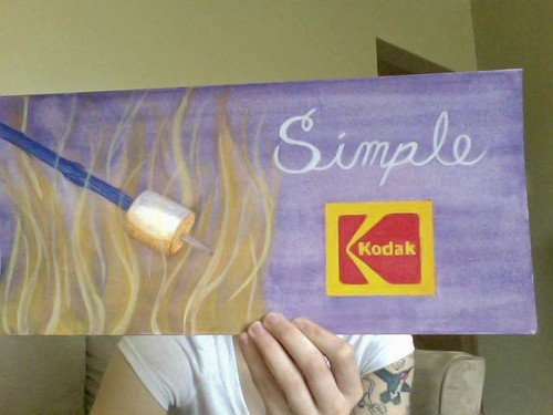
This was simply a hypothetical project, but it was still a lot of fun! The only constraints I had was that I needed to perfectly reproduce the kodak logo and I had to have some kind of text on it. So I began generating thumbnails as I always do. Summer is fast approaching and I'm so ready for it; this is what inspired all of my concepts. I wanted something where the image would do most of the talking and the text would be a single word to summarize it. Advertising via Billboards means you have approximately 3 seconds to communicate with a consumer--too much text would make communication increasingly difficult and could potentially cause a car accident!

I decided to go with the roasted marshmallow concept (first thumbnail) because I connected with it the most and I think others would too. So to start I laid my ground colour down. Since I am working with Gouache, a paint similar to water colours, I had to leave some areas white otherwise my ground would show through in areas where it shouldn't be at all (ie: the Kodak Logo, marshmallow). I created the 'ghost areas', the word simple and the flames behind the marshmallow, I created by letting my paint dry slightly and then painting with a damp brush with no paint on it. This removes some of the paint that you have already laid down.


Next I began painting in my elements. The Kodak logo took the most time because I needed to be very precise. The flames were made with a wide, flat brush and over saturated paint of different values.


Kodak_final Finally, I finished up the Kodak logo and added a final value to the flames. Later I'll try to get a picture of it in the Billboard miniature model.


Take care and have a lovely Friday the 13th and a great weekend! Cheers

Sunday 8 April 2012

Discoveries on James Street North - Humblepie


A few weeks ago some friends and I took a stroll down James Street North, Hamilton Ontario. First we went for lunch at the Harbour Diner near Picton Street. The Pulled Pork Poutine I had was delicious and my eyes were clearly larger then my stomach. A few of us asked for our left-over to be wrapped up and they came back in various Tin-Foil animals!! A swan for me, a snail for Jess, Zo got a crab, and Sasha got an elephant. I’m from a small town and things like that don’t happen there! It was the coolest, and I made sure the entire restaurant knew it!

We walked back up James Street, Tin-Foil zoo in hand, and visited The Factory, B3 Gallery, New Media Art Supplies, and finally Humblepie. Humblepie quite honestly felt like home to me! Something just felt right.

Susan treasure hunting through
supplies in the workshop
Humblepie is a Lifestyle Concept Shop that focuses on eco-living and upcycled, vintage fashion and home décor. This space doubles as a retail store and a working studio – the studio is in the back portion of the shop.

Susan Edwards, the owner and innovative mind behind this shop, told me about the variety of ‘upcycling’ workshops they hold as well as musical events held on site. I piled her with questions and waited with wide-eyed anticipation for her responses. I got tips to her trade as well as hints on how I can enhance my Harmonica playing. Susan is a very down-to-earth kind of person and you can see pieces of her in every design she has made.

Susan's favourite piece!
Humblepie serves as a time machine as soon as you step through the door. More than that it’s truly a testament to how “One man’s junk is another man’s treasure!” We can all learn from Susan’s perspective of how most of what we would normally send to a landfill can be ‘upcycled’ and reborn into eclectic and original works of art.

Thank you so much Susan for taking time out of your day to make my day! Keep up the amazing work, and I hope to come back for a visit soon!