Friday 13 April 2012

Kodak Billboard Concept

This was simply a hypothetical project, but it was still a lot of fun! The only constraints I had was that I needed to perfectly reproduce the kodak logo and I had to have some kind of text on it. So I began generating thumbnails as I always do. Summer is fast approaching and I'm so ready for it; this is what inspired all of my concepts. I wanted something where the image would do most of the talking and the text would be a single word to summarize it. Advertising via Billboards means you have approximately 3 seconds to communicate with a consumer--too much text would make communication increasingly difficult and could potentially cause a car accident!

I decided to go with the roasted marshmallow concept (first thumbnail) because I connected with it the most and I think others would too. So to start I laid my ground colour down. Since I am working with Gouache, a paint similar to water colours, I had to leave some areas white otherwise my ground would show through in areas where it shouldn't be at all (ie: the Kodak Logo, marshmallow). I created the 'ghost areas', the word simple and the flames behind the marshmallow, I created by letting my paint dry slightly and then painting with a damp brush with no paint on it. This removes some of the paint that you have already laid down.


Next I began painting in my elements. The Kodak logo took the most time because I needed to be very precise. The flames were made with a wide, flat brush and over saturated paint of different values.
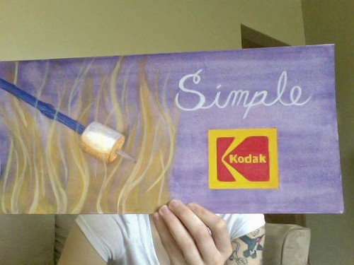


Kodak_final Finally, I finished up the Kodak logo and added a final value to the flames. Later I'll try to get a picture of it in the Billboard miniature model.


Take care and have a lovely Friday the 13th and a great weekend! Cheers

Sunday 8 April 2012

Discoveries on James Street North - Humblepie


A few weeks ago some friends and I took a stroll down James Street North, Hamilton Ontario. First we went for lunch at the Harbour Diner near Picton Street. The Pulled Pork Poutine I had was delicious and my eyes were clearly larger then my stomach. A few of us asked for our left-over to be wrapped up and they came back in various Tin-Foil animals!! A swan for me, a snail for Jess, Zo got a crab, and Sasha got an elephant. I’m from a small town and things like that don’t happen there! It was the coolest, and I made sure the entire restaurant knew it!

We walked back up James Street, Tin-Foil zoo in hand, and visited The Factory, B3 Gallery, New Media Art Supplies, and finally Humblepie. Humblepie quite honestly felt like home to me! Something just felt right.

Susan treasure hunting through
supplies in the workshop
Humblepie is a Lifestyle Concept Shop that focuses on eco-living and upcycled, vintage fashion and home décor. This space doubles as a retail store and a working studio – the studio is in the back portion of the shop.

Susan Edwards, the owner and innovative mind behind this shop, told me about the variety of ‘upcycling’ workshops they hold as well as musical events held on site. I piled her with questions and waited with wide-eyed anticipation for her responses. I got tips to her trade as well as hints on how I can enhance my Harmonica playing. Susan is a very down-to-earth kind of person and you can see pieces of her in every design she has made.

Susan's favourite piece!
Humblepie serves as a time machine as soon as you step through the door. More than that it’s truly a testament to how “One man’s junk is another man’s treasure!” We can all learn from Susan’s perspective of how most of what we would normally send to a landfill can be ‘upcycled’ and reborn into eclectic and original works of art.

Thank you so much Susan for taking time out of your day to make my day! Keep up the amazing work, and I hope to come back for a visit soon!

Friday 6 April 2012

When I fell in love--with design.

Back in high school, the year that Grey's Anatomy forced Snow Patrol onto the radio I fell for the band. At first it was simply their unique sound that enthralled me (Side story: my mom related them to The Cars), but when I picked up their Eyes Open CD for the first time I was sold on the design. It has been my goal and my dream to design something that I love as much as that and to print it on someone's CD.

The designer of this master piece, I've recently discovered, is Mat Maitland -- most commonly know for his work with Big Active design company.

While researching this mysterious genius (the only biographical material I could find is on Wikipedia and even that is fairly vague) I came across his portfolio of more recent creations. I thought I'd share some of my favourites (I still don't think they top Snow Patrol's cover though ;) ) -- enjoy.