Thursday, 13 September 2012

Live on Locke: The Music Movement Final Logo

Hello once again blogging world. Please forgive me for not keeping up with this blog over the summer.

Last we spoke, I posted about the progress we had made on the "The Music Movement" logo. Well earlier this summer we finished it and here is how the final product came about!

Here are the changes to the 3 comprehensives the clients wanted to see.
  
Taking their ideas we generated these logos .


The clients liked "Idea 3" best and so stands the Final "Live on Locke" logo! Keep an eye out; the first concert of the series is September 21, 2012. Visit http://www.liveonlocke.com/ for more information on this event and the next concerts in the series, as well as ticket booking information.


Thursday, 31 May 2012

Live on Locke: The Music Movement - Logo Comprehensives

TMM_Comps
Stage 2 of The Music Movement logo is complete. My colleagues and I have developed a comprehensive design and have provided our clients with 4 colour schemes to choose from.


We have also learned a few things while working on a couple of projects recently, including this one. We've discovered that it is really difficult to have three people work on one aspect of a project. Too many fingers in a pie leads to too much confusion and a really big headache! So from now on everyone will do their own thing and we will ask each other for advice when/if we need it. I'm not sure why we started working this way, maybe just the excitement of the first project as "3J Design Solutions", but whatever the reason we've made corrections and are better than ever!

Now we are looking forward to what the clients have to say and to finishing their logo.


Sunday, 20 May 2012

College Kids to Business (Wo)men

Well my college days are done and 'grown-up' life has come. Two years have flown by so quickly, and I have learned an incredible amount from all of the Graphic Design professors from Mohawk College; Thank you! I've also been blest with meeting tons of fabulous friends, some of which I consider family! Two of my closest friends I've made at college, I now call my colleagues. 3J Design Solutions is in the process of becoming a unique collaborative graphic design company. Jessica Bryers, Jessica Oddi, and myself (Jennifer Ridder) have come together with a shared vision. Each of us will specialize in a certain area with one umbrella area, that being illustration. I will focus on typesetting and layout design, Jessica Bryers is our proud packager, and Jessica Oddi is our web-design wizard. We all tackle other aspects of design as well; branding, advertising, ex-cetera, but those certain areas are our individual domains. Another great part of our business relates to the old addage: Three heads are better than one. On each project, big or small, we'll bounce ideas off of one another making concepts better and better.

We are working an a couple projects now while we continue the start-up process of our company. Our first project is a group in Hamilton (Ontario, Canada) organizing a Concert Series that will consist of 4 concerts, one per month starting in September. Our first step is to develop a logo for the event(s) which incorporated the name The Music Movement: Live on Locke. The meaning behind the name is that the purpose of the event is to move people out of their homes and onto the street to meet the people around them. Knowing your neighbours seems to have become a thing of the past and this group sees the value of bringing it back, they're creating a movement. Also the event(s) is going to be held on Locke Street, hence Live on Locke or LOL. Please take a look at the thumbnail sketches we've developed so far!

After the client reviewed the thumbnails they decided to continue with the concept Jessica Bryers made (identified with the '*'). From there we each developed new thumbnails based on that one. 
The client then identified the aspects of each of these sketches they liked. We are now working on applying these changes.


Friday, 13 April 2012

Kodak Billboard Concept

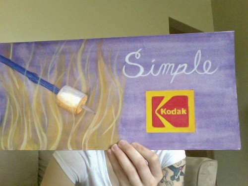
This was simply a hypothetical project, but it was still a lot of fun! The only constraints I had was that I needed to perfectly reproduce the kodak logo and I had to have some kind of text on it. So I began generating thumbnails as I always do. Summer is fast approaching and I'm so ready for it; this is what inspired all of my concepts. I wanted something where the image would do most of the talking and the text would be a single word to summarize it. Advertising via Billboards means you have approximately 3 seconds to communicate with a consumer--too much text would make communication increasingly difficult and could potentially cause a car accident!

I decided to go with the roasted marshmallow concept (first thumbnail) because I connected with it the most and I think others would too. So to start I laid my ground colour down. Since I am working with Gouache, a paint similar to water colours, I had to leave some areas white otherwise my ground would show through in areas where it shouldn't be at all (ie: the Kodak Logo, marshmallow). I created the 'ghost areas', the word simple and the flames behind the marshmallow, I created by letting my paint dry slightly and then painting with a damp brush with no paint on it. This removes some of the paint that you have already laid down.


Next I began painting in my elements. The Kodak logo took the most time because I needed to be very precise. The flames were made with a wide, flat brush and over saturated paint of different values.


Kodak_final Finally, I finished up the Kodak logo and added a final value to the flames. Later I'll try to get a picture of it in the Billboard miniature model.


Take care and have a lovely Friday the 13th and a great weekend! Cheers

Sunday, 8 April 2012

Discoveries on James Street North - Humblepie


A few weeks ago some friends and I took a stroll down James Street North, Hamilton Ontario. First we went for lunch at the Harbour Diner near Picton Street. The Pulled Pork Poutine I had was delicious and my eyes were clearly larger then my stomach. A few of us asked for our left-over to be wrapped up and they came back in various Tin-Foil animals!! A swan for me, a snail for Jess, Zo got a crab, and Sasha got an elephant. I’m from a small town and things like that don’t happen there! It was the coolest, and I made sure the entire restaurant knew it!

We walked back up James Street, Tin-Foil zoo in hand, and visited The Factory, B3 Gallery, New Media Art Supplies, and finally Humblepie. Humblepie quite honestly felt like home to me! Something just felt right.

Susan treasure hunting through
supplies in the workshop
Humblepie is a Lifestyle Concept Shop that focuses on eco-living and upcycled, vintage fashion and home décor. This space doubles as a retail store and a working studio – the studio is in the back portion of the shop.

Susan Edwards, the owner and innovative mind behind this shop, told me about the variety of ‘upcycling’ workshops they hold as well as musical events held on site. I piled her with questions and waited with wide-eyed anticipation for her responses. I got tips to her trade as well as hints on how I can enhance my Harmonica playing. Susan is a very down-to-earth kind of person and you can see pieces of her in every design she has made.

Susan's favourite piece!
Humblepie serves as a time machine as soon as you step through the door. More than that it’s truly a testament to how “One man’s junk is another man’s treasure!” We can all learn from Susan’s perspective of how most of what we would normally send to a landfill can be ‘upcycled’ and reborn into eclectic and original works of art.

Thank you so much Susan for taking time out of your day to make my day! Keep up the amazing work, and I hope to come back for a visit soon!

Friday, 6 April 2012

When I fell in love--with design.

Back in high school, the year that Grey's Anatomy forced Snow Patrol onto the radio I fell for the band. At first it was simply their unique sound that enthralled me (Side story: my mom related them to The Cars), but when I picked up their Eyes Open CD for the first time I was sold on the design. It has been my goal and my dream to design something that I love as much as that and to print it on someone's CD.

The designer of this master piece, I've recently discovered, is Mat Maitland -- most commonly know for his work with Big Active design company.

While researching this mysterious genius (the only biographical material I could find is on Wikipedia and even that is fairly vague) I came across his portfolio of more recent creations. I thought I'd share some of my favourites (I still don't think they top Snow Patrol's cover though ;) ) -- enjoy.


Wednesday, 21 March 2012

Illustration Friday -- Shades

Hello again! I'm really excited to share this week's illustration with you. It is the first time I've really attempted digital painting and I feel that it went really well. To start, my Artist Inspiration is Walter Everett. In this piece I really liked the soft painterly style as well as the muted tones (or shades ;).


The next step was, once again, to generate thumbnails. My first instinct was to draw sunglasses and use a monochromatic colour scheme, but I figured that was too obvious and not enough of a challange. Instead I began thinking of other things that we use to produce shade. I decided to continue with the beach umbrella concept. The weather is warming up here in Southern Ontario; not at all common for March in Canada. Earlier this week I broke out the BBQ so summer is definitely in the air, and I was inspired to draw from that feeling. (I haven't had a chance to scan my thumbnails yet, but I promise they are coming :)

To begin, I set up my document in photoshop and painted in my ground colour. I used a soft-edge brush and lowered my 'opacity' and 'flow'.


Next I separated my image area into Foreground, Middle-ground, and Background by painting in various elements.


Then I began to focus on the sky. I added shadows to the clouds and sunlight filtering through from behind them. I really love the way this worked out; it's fun to play around using different layers and layer orders (I had the sunlight layer in front first, but it looks so much better behind!).

On to the water. I painted in some darker tones to show the different depths in the water as well as to create bases for waves that I would add detail to later.


Naturally the next step was to add the crests to the waves. I also added details to the water that was washing up on shore.


Next I added sunbeams that reflected off the water and the sand. I set this layer to 'soft-light' blending mode.


Then I added the umbrella. It was already slightly transparent because I had turned down my brush's opacity in the beginning, but I reduced the layer opacity just a tiny bit more.


I found that the umbrella was taking up more of the scene than I wanted so I scaled it down some.


Shades
Once the main image was complete I brought it into InDesign and added text. I also played with the scaling of this image to fit a portion of it on the CD.

Tuesday, 13 March 2012

Emotional Labour - A response to Seth Godin's Definition

Seth Godin defines emotional labour as "the act of connecting to another human being and making a change even if it’s not easy for you to do in that moment". Through the use of social media sites, connecting with people all over the world is easier than ever; so why don't more people do it? I think, or rather I used to think, that it was annoying or irritating because making these connections seemed to be one more thing to add to my ever growing 'To Do List'. I would make excuses like, "Do other people really want to hear what I have to say? I only know so much, I don't have a lot to offer." 


The fact of the matter is Yes, if you are interested in something chances are there is someone else out there who is interested too; it really is a small world when you think about it. Once you start a relationship with that person, they may mention you to a friend, who might pass your information to a friend, who tells their mother, who passes it to her barber, who tells... well I think you get it. Soon enough you've made this giant web of people all interested in the same thing, information gets thread though-out and the thing you started so as to teach/inform others has now become a source of learning for yourself. 
The best part about this is IT'S FREE! You loose nothing more than a small portion of your day and you gain attention form a business stand point, knowledge for personal growth, and relationships with people you may have never met any other way.Technology was created to make life easier, not to become a chore.


As I learn this way of thinking and perspective I know that I need to make a conscious effort to branch-out and find people with similar interests as me. Previously the only reason I used the internet was to check-up and family and friends on Facebook, Google Image search for reference material, hotmail for emails, etc. But the internet is so much more than that; it's a world to be discovered. I grew up with the internet and still I've only crossed the threshold of its vast realm of opportunity.


One site that I have become accustomed to using is morguefile.com. This is a site that offers FREE stock photo images. The people who contribute to this site clearly don't do so for the fame or fortune, but rather because they love taking remarkable photos. Perhaps more than that, they love that other people appreciate their talent and want to use their photos. Seth Godin would describe this as being part of a "gift culture". The give and take of photos has made this site my go-to whenever I need quality reference material or stock-photos. It's because of this relationship that I pass fellow designers along to this site for their stock photo needs. Here is an example of that 'web of interest' being created again.


Another site I find I go to a lot is thinkexist.com. I love putting meaning into my art, occasionally I keep it to myself, but I usually let it be know. An easy way to get inspired is through the words of the great minds of the past. This sight has an enormous database of quotes from thousands of people throughout history and they cover a vast range of topics. Once again this sight is free! I sometimes think that 'I'm too tired to be creative, or to draw', but I don't think I'd ever have the energy or interest to search through decades upon centuries of quotes from people and put them in an online database, and certainly not for free. But someone did! Someone pulled there resources and their energies together, and did the intense labour that I didn't want to do but benefit from so much.


Still another site I go to for inspiration or simply personal interest, is AZ Lyrics. Music plays a huge role in my life, and in the lives of many people. I rarely am without my favourite iTunes playlists playing in the background of whatever I'm doing. Whether it's drawing, writing, cooking, whatever -- there's music. As a result meanings or themes of the music I listen too, perhaps the feelings generated by a song, often creep into my art and to focus these things I take a look at the lyrics using this fantastic, free database site.


To the creators and contributors of these sites, I thank you and applaud you!


What I'm trying to say, in this long winded post, is that you should do the work you love -- even if you don't feel like doing it today. Share it! Someone, somewhere will appreciate that you did, and I truly believe that what goes around comes around. This small attempt at making a change because of something you love will result in good 99.9% of the time.

Sunday, 11 March 2012

Illustration Friday - Yield

After a break I'm back to Illustration Friday; this week's word is Yield. On that note, I'll be taking my artistic inspiration form Lynd Ward this week. I this first image I love the dark intensity to it, but I don't like the amount of solid blocks of black. That is where the second image comes in. This image uses simple textures and colour washes, but has an energetic, childlike air to it. I'll take the deep emotion in the first image and generate it using the technique of the second. If this doesn't make sense, it will as we go along!


My initial definition of 'yield' was in the context of yielding fruit or other crops (second row, left-most image). Though I liked the idea of doing an illustration to pay homage to my rural roots I figured this meaning of the word was too common and didn't evoke a very deep emotion for me. As I researched and thumbnailed ideas in my head I took the context of yielding to something -- surrendering.


I think everyone has or will have to surrender something in their lives and this act of sacrifice is always one of great difficulty, but it can either be freeing or painful to our core (first images).

Okay, lets get started -- step 1, print off my template and create a sketch. I know it's a little tough to see, but bear with me!


Now I started applying ink to the CD cover using a rough hatching technique. 


Here's how it looked when I was almost done adding the ink to the cover.


Once that element was done I moved on to the CD portion. I applied similar, but varied hatching to the CD.


Wa La, the ink is down and I've scanned my image onto my computer.


 From here I added small washes of colour in photoshop.


Yield_7-text
In InDesign I clean up my edges and add text. 
And there you have it! Until next week; cheers!