Well my college days are done and 'grown-up' life has come. Two years have flown by so quickly, and I have learned an incredible amount from all of the Graphic Design professors from Mohawk College; Thank you! I've also been blest with meeting tons of fabulous friends, some of which I consider family! Two of my closest friends I've made at college, I now call my colleagues. 3J Design Solutions is in the process of becoming a unique collaborative graphic design company.
Jessica Bryers,
Jessica Oddi, and myself (Jennifer Ridder) have come together with a shared vision. Each of us will specialize in a certain area with one umbrella area, that being illustration. I will focus on typesetting and layout design, Jessica Bryers is our proud packager, and Jessica Oddi is our web-design wizard. We all tackle other aspects of design as well; branding, advertising, ex-cetera, but those certain areas are our individual domains. Another great part of our business relates to the old addage: Three heads are better than one. On each project, big or small, we'll bounce ideas off of one another making concepts better and better.
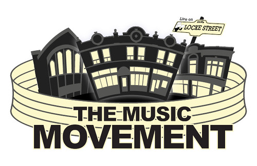
We are working an a couple projects now while we continue the start-up process of our company. Our first project is a group in Hamilton (Ontario, Canada) organizing a Concert Series that will consist of 4 concerts, one per month starting in September. Our first step is to develop a logo for the event(s) which incorporated the name The Music Movement: Live on Locke. The meaning behind the name is that the purpose of the event is to move people out of their homes and onto the street to meet the people around them. Knowing your neighbours seems to have become a thing of the past and this group sees the value of bringing it back, they're creating a movement. Also the event(s) is going to be held on Locke Street, hence Live on Locke or LOL. Please take a look at the thumbnail sketches we've developed so far!


After the client reviewed the thumbnails they decided to continue with the concept Jessica Bryers made (identified with the '*'). From there we each developed new thumbnails based on that one.
The client then identified the aspects of each of these sketches they liked. We are now working on applying these changes.
 We have also learned a few things while working on a couple of projects recently, including this one. We've discovered that it is really difficult to have three people work on one aspect of a project. Too many fingers in a pie leads to too much confusion and a really big headache! So from now on everyone will do their own thing and we will ask each other for advice when/if we need it. I'm not sure why we started working this way, maybe just the excitement of the first project as "3J Design Solutions", but whatever the reason we've made corrections and are better than ever!


