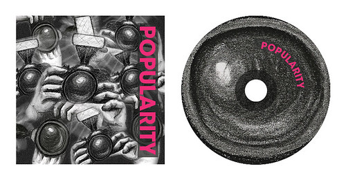
The style he uses generates an uneasy feeling of mistrust. This is kind of what I feel when I think of popularity. Think back to high school; there were always those kids that everyone wanted to be friends with, but those were often the kids that very few people trusted. You were never sure where their loyalties lied or what there motives were. I believe that they too must have, at times, wondered who their true friends were and who was just playing the game.
Here are the concepts I've come up with. I'll keep going with the paparazzi concept. Having a cluster of lenses thrust in the viewer's face, paired with the grungy charcoal effect that Stahl uses, will do a great job of communicating the feeling of tension and suspicion.
For this Album cover I'm going to draw the elements separately and the compile them on the computer. I drew my 2 paparazzi on separate pages in pencil first and then began rendering with the charcoal.
I then scanned my images to begin processing them digitally.
I took the scanned images into Adobe Photoshop and began editing them.
I did some general colour correction, but also greatly enhanced the contrast using Curves and a High-pass filter with a Hard Light blending mode.
Next I began multiplying and arranging the paparazzi using Photoshop.
I also used Photoshop to isolate one lens to use for the CD graphic.

Finally, I took these new images into InDesign and added text. I used a bold sans-serif font to communicate confidence and I used a deep pink colour to 'pop' against the grayscale images behind it. I also included an semi-transparant charcoal coloured block behind the text to make it even more legible.
Next I began multiplying and arranging the paparazzi using Photoshop.
I also used Photoshop to isolate one lens to use for the CD graphic.

Finally, I took these new images into InDesign and added text. I used a bold sans-serif font to communicate confidence and I used a deep pink colour to 'pop' against the grayscale images behind it. I also included an semi-transparant charcoal coloured block behind the text to make it even more legible.


Wow, wonderful concept and execution for the Popularity theme AND for a CD cover too. ^_^
ReplyDeleteI love that you thought to copy paste the illustrations to make this! Really cool!
ReplyDelete