
Good Monday Morning! I hope you all have a had a wonderful weekend!
We are getting started this week with another great project. I will be generating a poster for International Women's Day. Each week I will update you with my progress on this piece.
My concept will revolve around a portrait of my older sister. She is an inspiration to me everyday. She's always been there for me, even when I didn't think I needed her :) She is a teacher with a passion for her students that surpasses many others! I love her so much, and hope to communicate all of this in my work.
An artist that has inspired me for this project is Al Parker. Here are a few examples of his work:


Now for my concept stage...here are my thumbnails. The concept I am going to proceed with is the left sketch from the set of 2 thumbnails.


This is the reference photo of my sister that I am going to use as the main portrait.
 Before I move on to painting or even a rough sketch to size, I want o have a plan for when i add colour to my piece. I've explore a few colour schemes and have decided to go along with the last one I tried. Seen here in the bottom right corner. The mainly earthy tones contrasted with the airy blue captures my sister's personality! Also the blue goes along with the wedding portrait; "Something old, something new. Something borrowed, something BLUE!"
January 19
 This is the rough sketch I made as a trial run as well as a guide fro when I begin painting. Sorry about the quality of the image, the size I made it is too big for my scanner and my camera is apparently broken.
January 23
 It was pointed out to me that this piece needs some visual tension to make it more eye-catching. I've created some thumbnails of concepts that I feel fix this problem quite well! Caryn is a History and english teacher, so I've chosen to place some giant books in the background. They will be different shades of brown and be simple blocks of colour so as not to distract from the portraits, but rather enhance the overall composition.
January 26
And the painting begins! I started by laying down a few coats of Gesso as a primer on my masonite board. Next I went over the board with a peach/flesh-tone colour as my base. After that I drew out my elements.

January 30
From there I began really painting. First with the books in the background; not worrying about details at this point.
 Then on to the wedding dress and the text areas. It's always best to work with the big areas of colour first and work your way smaller.
January 31, 2012
While I was looking for inspiration pieces for my Illustration Friday work, I came across these images by Walter Wyles. I'm hoping that I can use these as reference to get the texture of my sister's hair more life-like.


Now for more painting! :D Smock, paint clothes, easel, brushes, water and acrylics? Yup, I'm good to go!
 |
| Working on smaller blocks of colour. |
 |
| Applying a second coat to the title. |

February 5 (Superbowl Sunday!!!)

I also did another white coat on the fabric around the bouquet as well as stems to the flowers.
February 6


February 13


I'm getting closer and closer to the final product! I've really enjoyed the journey so far and have surprised my self a few times as well ;)
February 16


The painting is complete and on Tuesday this week I did my copy photography for it [It was too large for an average scanner so I had to take high-quality photos of it instead].
I've added title text, begun colour retouches and enhancements, and I also added floral print to the background.
The last step was to add a brief description of Caryn and then get the file ready for printing!
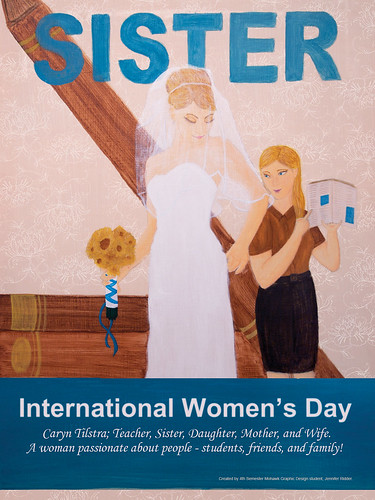
Ta Da -- The final is complete! This poster will be entered in a contest to be showcased on a Cable 12 International Women's Day special; Click here to go to link. I'd appreciate your vote :)
We did it -- I won! One day this week I'll go in for an interview for the International Women's Day special! :) Thank you to all of you who voted for me! I really appreciate it!
I think this shows great potential, Jen... its just still missing something, and I think that thing is some element of visual tension. Currently the composition is very balanced. The area "Sisters" takes up is mirrored by the area along the bottom that "International Women's Day" will occupy. The space being used by the two figues divides the page down the middle. As you may recall from last year's class on composition, this results in a very static composition. You need something to draw the viewer's eye through and around the composition. Parker achieved this in the example you posted of the three girls by the way he broke up the background into uneven areas of colour - and with the variety of interesting patterns in the three girls' clothing. Take another look at what you have so far and see if you can find a similarly powerful way of grabbing the viewer's attention and holding it. Some small colour thumbnail explorations might do the trick! :^)
ReplyDeleteHi Leif,
ReplyDeleteThanks for the advice! Take a look at the new thumbnails I've added; what do you think? :)